You can use colors, sizes, or shapes to add attributes for more complex charts. Based on the type of column you add, Visualizer helps you choose between different visual elements and different chart types.
After you add the first measure and attribute, as you drag another attribute from the subject area to the Chart Builder or Canvas, Visualizer recommends how the measure or attribute can be visualized. Drop the measure or attribute over the option you want and Visualizer creates the new chart style.
Topics on This Page
Add Colors to a Chart
- In Visualizer,
add a measure and an attribute to plot a chart.
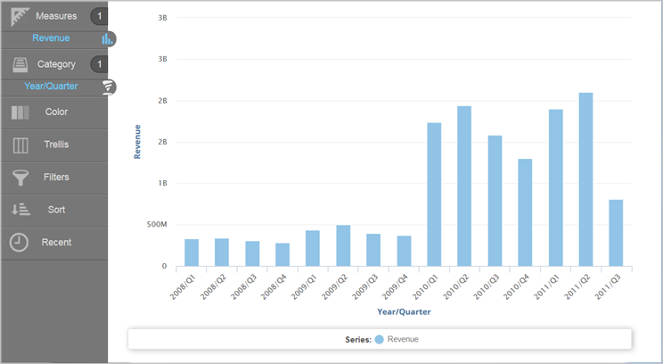
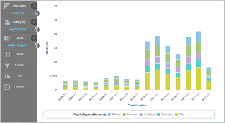
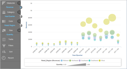
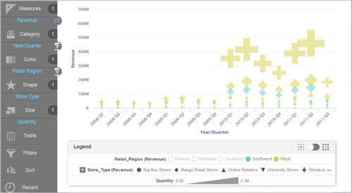
Example: Use Revenue by Year/Quarter as a column chart.

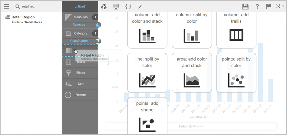
- Divide the columns into colored sections that represent another visual dimension. Search or browse for an attribute and drag it to the Chart Builder. Perform one of the following actions:
- Drag and drop the attribute onto Color.
- Drag and drop the attribute onto one of the suggested visual options. This is also a way to change the chart type.
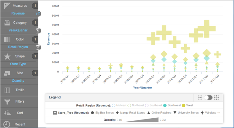
 Example: Add Retail Region to Color.
 Tips:
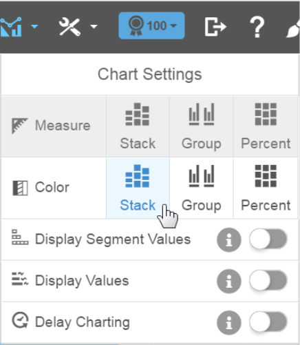
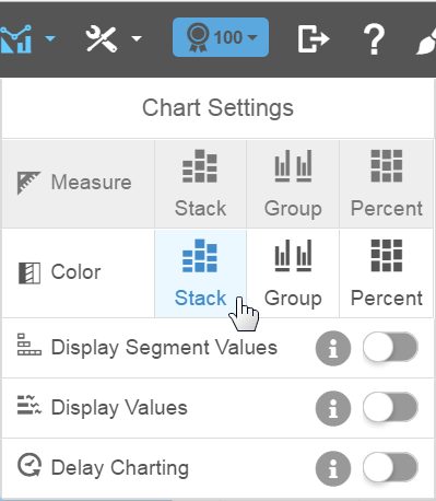
Tips:- When you use the Color bucket, the Chart Settings menu allows you to select different ways to visualize your data for the specific chart type.
- If you display segments such as with a stack, you can enable the Display Segment Values option to show the values within the segment, space permitting.
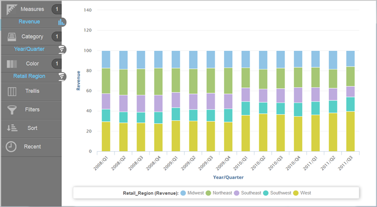
- You can change how the Region dimension colors appear in a column chart. For example, you can display the color bars by percentage.

- Click Save.
Tip: You can create additional color palettes for attributes.
Add Sizes to a Chart
Some visualizations are more useful when you add a dimension represented as size. You can add a measure to a bar chart and change it to another chart type that uses size. Visualizer suggests charts that work best with size.
- In Visualizer, drag the Quantity measure to the Canvas and
select bubble chart from the options.
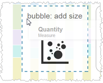
Visualizer creates a bubble chart using the quantity measure as the size of the bubbles.
 Tips:
Tips:- In
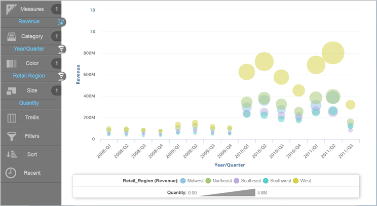
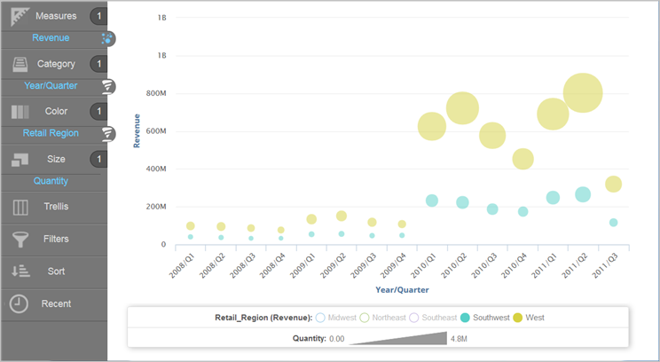
a bubble chart, click on items in the legend to hide or show bubbles in
the chart.

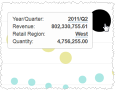
- Hover
over a data point to see its details.
- In
a bubble chart, click on items in the legend to hide or show bubbles in
the chart.
- Click Save.
Add Shapes to a Chart
Some visualizations are more useful when you add an attribute represented as shape. You can add an attribute to a bubble chart and change it to another chart type that uses shape. Visualizer suggests charts that work best with shape.
- In Visualizer, drag the Store Type attribute to
the Canvas and choose scatter chart from the options.
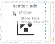
Visualizer creates a scatter chart using the Store Type attribute as the style of the shape.
 Tips:
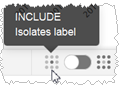
Tips:- The
Legend has an Include/Exclude toggle to show or hide labels in the visualization.
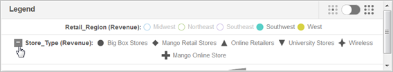
- When a Legend is large, it hides some of its items. To see hidden items, click
+.
- The
Legend has an Include/Exclude toggle to show or hide labels in the visualization.
- Click Save.